Wednesday, January 15, 2014

Blasts from Our Decorating Past

American Home December 1942

The American Home, December, 1942


Much has been written lately on re-purposing a formal dining room to suit the needs of a modern family. Suggestions have been as wide-ranging as pitch the table out altogether and turn it into a playroom, or use it as a craft room or even a billiard room!  Examples of families who have transformed their dining rooms are frequently found today in decorating magazines and on internet sites. However, before we pat ourselves on the back and proclaim how clever we modern women are, determined to develop our own sense of style and fashion rather than imitate that of our parents or grandparents, let's take a look at this ad from the December, 1942 issue of The American Home magazine.


Armstrong Linoleum Advertisement, December, 1942


This ad shows suggestions for changing "the laziest room in the house". The cabinets flanking the center buffet are used as a sewing center and an office. The linoleum flooring is touted as being easy to clean and durable. Wouldn't this scheme be easy to replicate in our 21st century dining rooms? Two inexpensive cabinets such as those IKEA sells could easily fit on either side of a credenza or buffet. Note the height and depth differential of the center piece in the illustration. Another design point is that the cabinets have been painted the same color as the walls. Best of all, the room retains its table and seating, providing extra work surface while preserving its original function--a place for family to gather for meals! In the re-purpose versus multi-purpose war, it is easy to see where my allegiance lies.

My formal dining room is used for occasional web surfing via my laptop and ....well, dining. I am far too messy while cooking to serve every meal in the eat-in kitchen! For a change, every now and then, I set the dining room table, dim the chandelier and sit away from the visible chaos of the kitchen. I like the sense of occasion and the ambiance that a softly lit room ( complete with my husband's constant comment " I can't see my food!") gives a meal. So, before following through with a plan to change your dining room into a place only a few family members can use, take inspiration from suggestions made 72 years ago, and design a dining room that everyone can use and enjoy!

Friday, January 10, 2014

Keeping It Green - Befores and Afters

To continue the theme of the last post on the idea of one man's trash becoming someone else's beloved treasure, I came across a blog called Planet Thoughts. The statistics were almost overwhelming. In a post entitled, The Truth About Trash - The Throw Away Society, the author cites an EPA study which states that 8,550,000 tons of furniture and furnishings are thrown away by Americans each year.

Think about that figure! As a society, we throw eight million, five hundred and fifty thousand TONS of furniture away each year. EACH YEAR! That is a shocking statistic to process. In view of those numbers, we feel that the current path we are on, the process of "remaking" furniture and accessories, is one of the best recycling projects we could attempt. It is simplistically beautiful. To begin with, it's an environmentally green proposition: we reduce the amount of furniture that is piled on the rubbish heap each year, and we give new life to furniture that has seen better days of service in someone else's family, usually a family that was growing from the 1920's through the 1970's. We often wonder how this chair was used, or that table was placed, or that mirror was hung. Often, we even look to vintage magazines to see how some of the orphaned treasures we find were showcased in their heyday, or how housewives of the period were influenced to decorate. Once upon a time, someone was just as excited to place that in their bungalow cottage, as we would be over a new Crate & Barrel chair, or a new Pottery Barn sofa.

Therefore, I thought I would show a few of the before and after shots of some of the pieces that are already on our storefront. It's truly interesting to see how much an object has metamorphized in its "remake" process, and where our perceptions of the basic structure, or bones of the piece, led us on a specific journey.

First, let's look at one of our matched pair of vintage Hepplewhite side chairs. Here is a before photo. My partner found these on the east coast when she was vacationing with her family last summer. They were coming apart at the joints, and were in a general state of neglect and disrepair.

Before:                                                                   After:
 
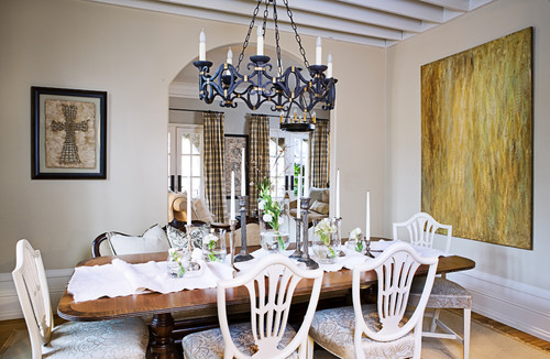
And, this isn't even the completed state of the finished product! There is more painting, highlighting and waxing to do, yet. However, you can see the vast difference between the state of the two photos. We have already had a few offers on these side chairs, and they are not even finished yet! People seem to be able using the one on the right in a room because it has been given an update just by the color of the paint. It will work beautifully in any neutral room. The graceful lines of the Hepplewhite style can still enhance a modern home today, and add eclectic charm as it is mixed and matched with other styles. Look at this use of them from designer Sherry Hart, who's listed on Houzz:

Traditional Dining Room by Atlanta Interior Designers & Decorators sherry hart

 Another great before and after is the elephant lamp that was a cast off from a friend of my partner. Her husband said, "What are you planning to do with that ugly thing?" But, we didn't see anything ugly at all! Granted, it did have a rather unattractive lamp shade, but it had potential! It was a piece that had quite a bit of vertigris and red tones in it. For some people, that would have been fine with their decor in a study or a den. But, we wanted to give it a more neutral tone that would blend with most neutral backgrounds.

Before & After:                                  

 This base is basically metal on a wood base. We took three different gilding waxes (German Silver, Celtic Bronze and Silver) and rubbed them all over the raised finish of the base, blending as we went. The result was a really good looking piece. We placed a shade on it for the photo, but we are not selling it with a shade. Our consensus was that it would look fabulous with a burlap shade. In the final photo we took, we placed an ivory linen shade on it. This would now make a great addition to that right man's study or office, or a den. We have this piece on our online storefront for sale.

Additional photos:

Thursday, January 9, 2014

Could There Be Anyone in the World Who Doesn't Love a Louis XV Bed?

There is nothing more beautiful than a Louis XV bed. Although it has all the majesty of it's period in design, stature and carving, it easily lends itself to the whimsy of a child's room; the romance of the "boudoir"; and, with the right colors and accessories, it can create the perfect ambiance for a man's bedroom. It really is a versatile style.

We recently began the transformation of an old Louis XV for a client who purchased it for her five year old daughter's bedroom. We wanted to share some of the photos of its progress before the project is finished.


The carving on this bed is simple, but exquisite. At one point, two finials had been attached at either end of the headboard, but they were missing by the time it came to me. However, as we all know, a little sanding and some wood filler work miracles! Actually, with the exception of that one problem, the bed was in great shape. The client left the color choices up to us, and we chose Annie Sloan Old White and Duck Egg Blue for the carved accents. As an aside, I have to admit that I am very tired of the color Duck Egg Blue. Since it came out, it has been completely overdone on pieces everywhere you look - on every blog, website and flea market you'll find some incarnation of it. Therefore, I want to use as little of it as possible. It's a great color, but enough is enough! But, after seeing the color that had already been chosen for the walls (Valspar's Gossamer Sky), there was no decision to be made. The main body of the bed had to be Old White, and the accent carving had to be Duck Egg Blue. It was the destiny of the bed!

Here are some early photos of the footboard with the initial work done - yet, still unfinished.


We'll post the entire bed when it is a finished project in a few short weeks. I know one little girl who is going to be sleeping like a princess very soon...

Below are a few French blogs that I found as I did some research, and I loved them! You will, too!


One Person's Trash Truly Is Another's Treasure...

My sister called me one day a few weeks ago, and asked if I wanted a mirror that someone she knew had picked up on trash day in an upscale neighborhood. Before I could even answer, she said "Free is good!" I agree. Free is not only good; it's great! I took the orphaned mirror in,and below is the result.


I know, I know - I don't have a before picture here. I have definitely learned my lesson on this issue! However, I will share with you that my goal for this project was to lighten it up and completely change the look of the piece. I used a wash of Annie Sloan Duck Egg chalk paint over the original dirty brown/bronze color; then I aged it with a wash of French Linen chalk paint. The next step was the simplest - I took a stiff bristled brush and used silver leaf Rub-N-Buff on the high relief carving at the corners and in the center of the frame, as well as on the inner frame surrounding the mirror. Voila! It was finished within 2 hours and I had a new piece! 

The moral of the story is, don't overlook any piece; as long as you have imagination, you can remake it into something that anyone might love to showcase in their home! There are more of these trash to treasure stories that will be shared in the near future!

This mirror is for sale on our online shop.


Tuesday, January 7, 2014

Barcelona Orange, Anyone?

As we all know, the color orange, in all of its incarnations, is a hot commodity. You can hardly leaf through a decorating magazine without finding their take on orange. Of course, the Annie Sloan line has its own version, called Barcelona Orange. It's a wonderful shade, and depending upon the type of wax you use to finish it off, you can achieve some great tonal depth in your piece.

Back in the early fall, we purchased a really interesting coffee table that was reminiscent of late seventies and early eighties oriental influence. It was a great piece, and our imaginations went wild thinking of the statement piece this could turn out to be. We finally settled on Barcelona Orange by Annie Sloan. We collected some great coordinating fabric samples from Brentwood Interiors to show our clients how they could use the orange color palette in their home with this table.


Yes, that's when we dove into Barcelona Orange with great anticipation... How did it turn out? We'll let you know in a future post!

Worthwhile Annie Sloan Book

I was so jealous of my business partner last weekend. We went to a shop that carried this book. She picked up a copy, and it was the only signed copy in the stack! How lucky was that? The book has good ideas and formulas for achieving new colors with the chalk paint you probably already have. Nice find!

Highlighted Artisan in New York Magazine

Just when I think we are accomplishing some fairly artistic highlights on an intricately carved applique, I run across articles like the one below from New York Magazine. If you think faux wall painting was a thing of the past, think again. Artisans like Matt Austin are keeping the craft alive and well. Read on...

Best Decorative Painter

Decorative painting by Matt Austin.  
Matt Austin
A self-taught artisan who works well under deadline, Matt Austin often gets summoned for what he terms “paint emergencies”—when someone has mistaken a faux-marble paint job for real stone and polished through a patch of it, or when a store needs a wall painted to look just like plywood and finished within three days. (This happened at the Marc Jacobs outpost on Bleecker Street.) Austin got his start doing decorative work for friends and relatives, and these days he has clients who fly him to Europe to paint their homes, but he’s not averse to doing a small $500 panel in between those $50,000 gold-leaf-mural jobs. He can do stripes (he once painted an elaborately patterned portico that required a quarter-mile of painter’s tape) and detailed pastoral scenes, and has turned children’s rooms into playful landscapes filled with hot-air balloons and palm trees. What’s he working on now? Oh, just a mural of hyperrealistic birds and butterflies on chinoiserie branches painted in doped copper—which makes the branches turn luminescent blue in the dark.

http://nymag.com/bestofny/services/2013/decorative-painter/